With the color schemes I chose, I could not tell the difference between the stretched and classified symbology methods on the actual maps as I was working in ArcMap. Accessing the properties box did show me that the stretched method is based on standard deviation while the classified method breaks the data into classes based on natural breaks. Once I posted the maps side by side, I was able to see differences. On the maps with the green to white color plate, the classified map shows more detail as I was able to manipulate the number of classes to further detail changes in elevation at the upper levels. Once I changed the color scheme to one that used multiple hues instead of levels of saturation, the stretched symbology method presented details better.
31 January 2010
02.03.10 Deliverable #2
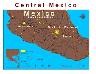
 I had trouble with the annotation conversion for the city labels in this exercise. I think the TS lagtime might have played a role since I ended up with two or three different labels for each city. Again I saved, saved, saved so starting over was not as frustrating as in the last exercise.
Since we were not relating any other spatial information that required a change in my world countries layer color, I kept the brown from Exercise #1. Another change I made is to the color that represent railroads. My old eyes could not see those tiny tracks in the default symbol so I changed the color to fire red and moved the layer to below highways so it would not overwhelm the map.
What do you think?
30 January 2010
02.03.10 Deliverable #1
No real problems with this except inexperience with the software. I wish ArcMap had an undo feature similar to that of MS Office products. One wrong click and I am starting all over. I also learned the importance of save, save, save.
I selected the yellow, orange, red color scheme to represent population data because the data is quantitative and the hue progression reflects the increase in population amounts.
27 January 2010
Deliverable #2 01.27.10

Well, I guess I should not do my labs so late at night or early in the morning! I missed the fact that I do not have a legend to specify what my colors represent. I am going to try to make the changes now. I hope it's not too late. SueB
--------------------------------------------------------------------------
The only problem I had with this exercise is that I could not find the coordinate display pointer to answer question #3. Can anyone help me with this?
A new problem just occurred when I went to create a new post. The blogger prompts me to change my existing post and I needed to delete my previous map in order to sumit this one. I can see from other posts that students were able to keep an archive of the older submission so I know I must be missing something basic.
Any assistance is appreciated!
SueB
15 January 2010


01.16.10
The only problem I experienced during these two exercises was differentiating between the toolbars in Arc MAP. In the beginning I selected the Layout toolbar zoom icon rather than the other toolbar zoom icon. (What toolbar is that?)
As a result my map was different from the examples and I repeatedly closed out of Arc MAP to start over. (Very frustrated!) Until that is, the lesson on bookmarks was presented. I still did not dawn on me that there were two zoom icons to select from but at least I didn't have to shut down the program to start over on the map.
Subscribe to:
Comments (Atom)


